Lara McEvoy - 319311
Unit 13: Final Major Project
Practical Skills: Post-Production - 5.1
Job Role: Editor
The post-production stage is where everything comes together. This is where you log all the footage, deciding what shots you will and won’t use, then moving onto the editing. Within the editing section you create the story, how you want it told is up to you, everything is filmed but how you piece it together is up to you.
Logging
(09 - 10/4/24)
Logging is an essential element of the post-production stage and the first. With logging, you go through all of the content filmed and decide whether you want to use the shot or not. In this I have gone through each day of filming in detail and decided which clips I can use, noted down time frames of the parts I want to use, and decided if there are clips, I don’t want at all. This has been dictated through a colour code where red = no, green = yes and orange/yellow = maybe. Each section of logging can be found below.
Logging Show 1
Application is no longer available.
If the PDF viewer above doesn't display anything then click the button to the right!
Logging Show 2
Application is no longer available.
If the PDF viewer above doesn't display anything then click the button to the right!
Logging Show 3/4
Application is no longer available.
If the PDF viewer above doesn't display anything then click the button to the right!
Logging Chloe interview
Application is no longer available.
If the PDF viewer above doesn't display anything then click the button to the right!
Logging Ella interview
Application is no longer available.
If the PDF viewer above doesn't display anything then click the button to the right!
Logging Emily interview
Application is no longer available.
If the PDF viewer above doesn't display anything then click the button to the right!
Editing Process
(10/4/24 - tbd)
10/4/24 -
I started the editing by opening premiere pro and creating a new sequence with the HD 1080P 25fps as these are the settings I filmed in. Making sure te sequence is set correctly will allow me to edit with little issues and not have to worry about the sequence formatting the video incorrectly.
After creating the sequence, I then made bins for all of the footage and labelled them, using logging, I then moved over the only good clips int the select folders. Doing this means I can find footage with ease and not have a bunch of useless footage sat in the Premiere Pro potentially slowing it down.


12/4/24 -
To start with I needed to think of how I was going to introduce the documentary and originally, I was wanting to do a montage kind of style, but I couldn’t find music, so instead went through the interview footage and dragged the clips of the three talking about the first show into the timeline. From this I then started to cut

out sections where the girls talked about how nervous they felt and more positive aspects where they are more uplifting. I want to use these as an introduction for the documentary as it would welcome the audience in, introducing them to the three and give a sneak peek at what the documentary is about.

After assembling the clips of the introduction, I then used opacity keyframes to fade the clips out and in. As shown in the image I have placed two opacity keyframes within the final clip and placed one at 100% and the other at 0% as this allows me to decide how long the fade out is.
In the timelapse, from 3:40, the process of me creating the title appearing behind the curtain. The first thing I had to do was actually find a font that I liked, so I went onto Dafonts.com and had a look for fonts that I felt would fit the theme of the video/introduction. From this I found a font called Mutharia which is a calligraphy looking font, which I feel fits the theme of the documentary. After finding the font I wrote in the title, centring it, but as shown in the image to the right, I wrote ‘behinf’ instead of ‘behind’ and I didn’t realise this until one of my peers pointed it out. This is a simple fix and was done very quickly, as shown in the timelapse.
Once these slight mistakes had been fixed, I made a start on creating the reveal of the text. The way I did this was through creating a rectangle mask around the text and then bringing it in so that the text is hidden before the curtains open. To have them be revealed from behind them, I went through every other frame and dragged the points on the mask further out, allowing the text to be revealed as the curtains opened. I really like how this turned out and feel it works as I intended. This is the first version of the introduction so I may end up changing it later on, but for now I am happy with it and how it looks.
16/4/24 -
Before moving forward with continuing the edit, I was adamant on finding music for the introduction. This is because I want the introduction to have a set feel and if I don’t find music for this soon then the whole, vibe (so to speak) of the piece wouldn’t work and I want this set from the start of the documentary. I started my search by looking on sites such as Artlist, Pixabay as well as youtube copyright free playlists as these are sources I have used before. While these are sources that I’ve used before, I still found I struggled with finding music that fitted the aesthetic/vibe I am trying to go for, so I ended up going onto pixabay and rather than searching for documentary music, I chose to look for background music.

From changing this search, I was able to find a track on Pixabay called Sedative by Lesfm. This wasn’t through searching any specific just background noise and clicking through the first 30 seconds of each track until I found the one, I liked and felt would fit. After finding the track and downloading it, I then added it into premier.
Once it was in premier, I used the razor tool to cut out the section of the track that I felt best fitted the introduction I had already put together. This meant I could then either lengthen or shorten the track, allowing it to fit, and I could see how the pacing worked and if this would need to be changed.
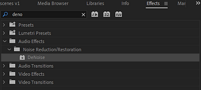
Once this was done, I listened through again and realised that the audio from the interviews was quite raw and crisp, which I’m not a fan of. So, to change this I went to the effects panel and searched for a feature called DeNoise, which I have used before. DeNoise, does what it says, it dampens the background noise and focuses on the more predominant sounds, however sometimes it dampens the audio too much. To change this, as shown in the timelapse below, you have to go to the ‘Effects Controls’ panel, find DeNoise, then click the down arrow next to amount and change it from 40% - 20%. Doing this makes the audio sound a lot clearer, without it being too crisp and raw, but still professional.
After I had moved the track to underneath the inro and watched it through, I realised that now I had music I could space out the dialogue heard and use


more b-roll/actuality. This process can be seen in the timelapse shown below. I found that the music really helped me to structure this introduction better, giving it more aesthetical value, while being both visually and audibly interesting. As I had been able to move the clips around and re-structure the introduction, I decided to export it out as version 1, because there is a high chance I will change bits around later on down the line, so to have a reference will be helpful. While having the music is useful, it did mean the dialogue needed to still be heard without the music overpowering this. The first step taken to do this was to simple lower the overall volume of the music track, this is simple but effective as I can edit the volume to a level that I think works best allowing the audio to be heard.

Here is the final timeline for the introduction. Now I have re-organised the clips into an order that fits with the music I am happier with it. Without music I feel it didn’t have much value, emotionally, and the audience would be bored just hearing voices with no background noise, so adding in the music helps to create ambience and a more engaging title sequence. To go with this the music has an uplifting feel to it which is what I was aiming to achieve.
17/4/24 -
As I have now completed the introduction and am happy with how it looks, I decided to move onto cutting the clips and creating the structure/narrative of the documentary. Seeing as I have 3 interviews to use, I pulled up the logging on my laptop (using it as a second monitor) and found the clips I needed and began cutting. For each segment/question I am going to select certain pieces that the three say and put them together, essentially creating a sentence from what each of them said. Doing this isn’t easy as I needed to go through each clip and listen carefully to what they were saying and make these connections between each of them meaning that when they are pieced together, they make sense. If the clips don’t make sense or flow when put together then this could become jarring for the audience to watch and listen to. In the timelapse this process can be seen.
For the first question, I decided to find all of the areas I wanted from the footage I shot that linked together and made sense as whole, then I went and found some music, once again off of Pixabay. This music is from the same artist and has a similar feel to the intro music. Initially I was wanting to use the music from the introduction and continue this throughout the first question or two, but after finding a different track I realised that I could bring the first track in at the end of the documentary instead, creating a link/coming back full circle. With the music in place, I then rearranged the clips slightly to fit with the music and pacing of it all. You will notice that there are black screens at times between these clips, but this is where actuality and b-roll are going to go, but at the moment I am focused on cutting the clips and getting the order/narrative told correctly before I go and add in all these extra elements. It’s important I focus on the core before adding in fancy details.
There isn’t much else to say about today’s editing as it is just cutting. Though it is boring for a documentary this is an essential part and what I am cutting now I likely to get halved for the final edit. At the moment I am going through and structuring it, adding in the elements I feel are essential and then later on in the editing process I can move on and cut out unnecessary areas. But I am happy with how it is coming along at the moment, running at roughly 4 mins with only the intro and first two questions done, so already beating the duration of last FMP, though that isn’t exactly difficult.
18/4/24 -
Today was mainly focused on continuing the fine cut the interview footage. As shown in the timelapse I have spent a long time finding the connections between what the three say and pieced them together so that they form a sentence. While this is a long process, this is going to be beneficial in the long run as I have crafted together a segment where it sounds as though the three are all talking about the exact same thing.
In the timelapse shown to the right, I also found some music which I could potentially use. This is another piece of music from the nutcracker which I think will work, however there is a high chance I decide not to use it and instead use some copyright free music. There was a point where the music got too loud but if I changed the volume as a whole then it would’ve been too quiet. So, to ensure that the dialogue can still be heard I used key frames, as shown in the image below, to bring the volume down ever so slightly during that section so its not too overpowering.
19/4/24 -
After continuing cutting yesterday, I set myself the goal of completing the first rough cut. This rough cut will have no b-roll or actuality as I want to just have a first cut where I have cut all the main content, I want there to be before going in with more areas. Because I knew what the task at hand was, luckily by the end of our morning lesson I had completed the first rough cut.
So far, I am happy with how this is coming along. I feel as though there are certainly areas which I will cut out later on down the line, but for now I am working with what I have cut. It’s running at 11 minutes right now, and as far as I’m aware, there aren’t any copyright issues because the music from Pixabay is copyright free and the Nutcracker music is also public domain.
Rough cut 1
Now rough cut 1 is done, I can start adding in b-roll and actuality. After my conversation with Ash on Wednesday, I knew I could skip over the first section because I don’t have the actuality for that yet, so made a start on the three reflecting on their roles now. So that I didn’t have to drag the footage over the top in the timeline, I decided to create a new sequence for
this, as in logging I have noted certain timestamps where the footage can be used, so having a separate sequence to find this will be more useful and speed up the edit.
The images to the right show how I created the new timeline, and how it is being used. Though this is a simple thing to do, its effective for me to use as I can use logging to find the clips I want, drag them into this sequence, use my logging to find the timestamps of useable footage. Me using this can be seen in the timelapse below.


While I was adding in the b-roll/actuality, I found that I wanted to add in areas where one of them are talking about a certain dance, then there’s a snippet of the dance shown to the audience. In the timelapse above, from 1 minute 30 seconds, I can be seen editing a clip of Chloe performing her Sugarplum solo. I wanted to include a snippet of this dance as I feel it will give context to what she’s talking about and give them an insight into what the whole documentary is about. Though I did edit a whole section of her dancing, I soon realised that it was too long, so I cut it in half and created to versions of the section. One edit with the first half of the dance shown, and the second where the end of the dance is shown. Doing this allows me to watch them through and decide which to use. At the moment I am more inclined to use the first half because visually it looks a lot better, but the second one would finish off the song meaning I can lead into the next section with more ease. This is something I will figure out when I next edit, likely to be Monday or Tuesday.
First half
Second half
23/4/24 -
This morning, I brought in the dvd of the dance show which the three are in as I am wanting to use this for archive footage. For this I asked Ash, the media technician, if he would be happy to download it from the DVD onto my SSD. This was something which he then went and did without showing me what he was doing, this isn’t ideal, but I am grateful it was done for me. Once it had downloaded, I then transferred it over to my SSD so I could move it over to the PC I am editing on. Then I popped it into premier pro and dragged it into the show footage sequence.

Once it was in premier, I went to find the areas where the three are, but I noticed that the framing wasn’t right. So, in order to fix this, I selected the clip, and went into the effect controls panel and scaled it up from 100 to 189 as this is what fitted the screen. Though this does lower the quality of the clip overall so I will have to see if there is a way to keep the quality, but the video still be seen.
Before moving on with adding in more b-roll, I decided that it would be a good idea to add in lower thirds. In pre-production I had created some ideas of lower thirds so decided to try out the one I liked best. However, once I had added it into premier-pro I didn’t like how the lower thirds came in and the feel they had. For me they were too formal and didn’t fit the aesthetic I was going for, while I like the font, I am unsure if having them fade in or fly in is the right way to go about this.
After looking at them for a while I decided that I wanted to try and have the lower thirds look as though they are being written in. Due to the font chosen, I feel as though this is going to work quite well and fit in


with the aesthetic I am going for. However, the only issue is I don’t know how to do this. So, I went onto google and searched how to create a handwriting effect and the main videos that came up were all using Adobe After Effects. After Effects isn’t a software, I am that familiar with, but I am going to try it out to see if it works how I want it to. The tutorial I used is shown below.
In the video shown to the left, you can see that through using the stroke tool, I have been able to draw/trace around the writing with each word having a separate mask. Doing this means that the writing will come in one after the other rather than at the same time. During the video I went into premier and adding in the lower third without any white background, but this meant it blended in too much and didn’t look right at all. So, I went back into After Effects and added in a second layer which was white and made it larger so it acted as an outline for the letters, which I think works a lot better.
How to export with transparent background
-
Click the blue text next to output module
-
Change format to ‘QuickTime’
-
Change the channels to ‘RGB + Alpha’
-
Click ‘Format options’
-
If not already, select ‘Apple Prores 4444’

After putting the final lower third into premier pro, I positioned it in the lower left of the screen, using the safety lines as guidance. Putting the lower thirds there was my original idea as it was more conventional, in terms of documentary, for me to do, however looking at it now, it doesn’t feel right having it there. Because of this I had a lecturer check the positioning of them and he suggested for me to move them to the upper left side rather than lower, as there is a lot in frame below, whereas the above area is a lot clearer.
The second image on the right is showing the positioning of the lower third. While this isn’t conventional, I feel it works a lot better than the bottom left of the screen. It is readable for the audience, and it doesn’t look out of place, it feels as though it fits there.
As I liked how this design of the lower thirds looked, I decided to create the other two on the same day. Initially I thought I would keep the colours the same, but it just didn’t look right, or more so it didn’t feel right. For me I felt it would look better if each person had their own colour, making them each individual, but sharing the same experience. Though I wasn’t


sure what colours to go for, so I went onto google and searched for a pastel colour palette because for Emily’s lower third I have used a darker pink colour so want to continue that aesthetic.
For Ella’s lower third, I was needing a colour which was different to the setting of her room. Her room within the shot looks quite blue, feature a couple different blue tones, so to make the lower third stand out I decided to use a purple. The purple I chose is shown in the image to the right, #cdb4db, as I felt that this would work the best for the lower third.
With Chloe, I did a similar thing as her room is mostly pink, I chose to go with a light blue for her lower third, #9cadce. In the image shown it looks more purple but when put into After Effects it comes out as a lighter blue, which I feel works well and fits the aesthetic that Chloe has.


As I had placed Emily’s lower third in the top left corner, I decided that rather than having them all in the same place I would position it in the lower left corner, conforming to documentary conventions. With Chloe’s I feel that this worked a lot better than the upper left corner, as there isn’t much in the lower left frame so having the text there works. Whereas with Ellas having it in the lower left, there’s too much light so having the white lower third there doesn’t work. So having it on the lower right, aesthetically, works better.
24/4/24 -
Today was focused on adding in b-roll/actuality, as the other days have been. To start with I found that this was going really well until I got to where Emily is talking about her solo. Within this section I had previously chosen what actuality I was going to use but there was no music, and it didn’t feel right without music. So, I decided to do what I had done for when Chloe was talking about her solo and use the music from the solo itself. With Chloes this was fairly easy as she was the Sugarplum Fairy, which was danced to the iconic music ‘The dance of the Sugarplum Fairy’, so I could find it easily. But with Emily’s her music wasn’t a piece I was familiar with, so I used shazam to find it.

From this I was able to find out the music was called ‘The Gay Hussar’ by The Excelsior Ropes. Then I went onto youtube to find the song, popped it into a youtube to mp3 converter then put it into Premiere Pro. As shown in the video, I added in the solo music and matched it up, but when I then put it with her talking, I found that it didn’t work as intended. Rather than it being some background music, no matter the volume I set it to, it was too loud. The music was more overpowering than Emily speaking which isn’t want I wanted, along with this it changed the mood of the piece quite drastically. I wanted the happy, lighter mood to continue rather than having heavy trumpets. Because of this, I decided to just have the sugarplum fairy music come in sooner and have some of Emily speaking without music. Which in an odd way worked.
In the timelapse to the right, you can see that while adding in b-roll and actuality, I have been cutting out areas from the rough cut one. This is happening as a consequence of me realising that either some of what is said isn’t needed, or I don’t have b-roll for it. While I like all of the content I had organised in the first rough cut, I realised that it isn’t needed and that some bits were just making it too long, and I felt this would bore the audience. Making these decisions mean I can also focus on the b-roll and having this on screen for longer, such as when one of the three are doing a dance which they mention. This is what I did with a section where Chloe talks about her solo, I decided to show a segment of this, so I cut out some other areas to make room for this (as I don’t want it to run over 10-11 minutes).
25/4/24 -
As I had been able to get past Chloes Sugarplum dance segment it meant I was able to focus today on editing together the duet segment. This is one of the bigger segments, I would say, as this is where Emily talks about the dance, explaining how it goes. In the timelapse, you can see the entire process undertaken to get where I wanted to.
To start this off I used the logging to find the two clips I needed for the end section of the dance, where the lift happens. From this, I downloaded the piece of music that the dance uses and put it into the show cutting sequence, allowing me to match it up as best as possible with the audio from the clip itself. Though this took some time, I feel that the piece of music really amps up the atmosphere for the audience, building tension, ready for the lift itself. Once I had been able to add this in, I then worked on putting in actuality and syncing the two clips together (shown from 1:05 in the timelapse).

With syncing the two clips, I approached this differently compared to when I created Chloes segment. For this segment, rather than using a different sequence to compile the clips together. I brought them into the main timeline, having one clip is the base and adding in two sections from a different clip. As I knew the dance, I knew where the clips needed to match, but it was a case of actually syncing the clips, watching where the two moved and spotting the similar movements. The first movement where I knew I would be able to sync was near the start of the lift as Annabell is swinging her leg into Emily’s arm and she’s just off the ground, going into the first turn.
The images on the right are from the two clips, the first showing the audience perspective clip and the beginning of the lift, and the second image from the above perspective showing the lift with some slight progression. While this isn’t perfect matching, as the lift is moving it isn’t obvious that the cut is in a slightly different place. Along with this, I had someone check this over and they said that they couldn’t tell the cut is in a slightly different place, which is really good as my intention had worked.
The next cut made; I knew I had to get the cut in the right place due to Annabell’s hand placement. In the first image you can see her hand is being placed onto Emily’s shoulder, and this is something I knew I needed to match within this section. The second image shows how her hand is placed within the same location but in a different shot. For continuity this is amazing because it clearly shows the connection, creating the illusion that these were shot on the same day, whereas in reality they were shot over two separate days.


Overall, I am really pleased with how this segment turned out. I have been able to edit this together, creating the illusion of one shoot on one day, cutting them at times where it flows and isn’t jarring for the audience. For me this is a huge step as I have always struggled with editing/continuity editing, so compared to last year this is certainly something I will reflect on during the evaluation stage. Also, I am pleased with the progress I have been able to make, I am nearing the end of the editing process and I just need to keep in mind that once its done its done, I don’t need to be consistently making small tweaks if they aren’t needed. Make only the necessary amendments then leave it.
26/4/24 -
There isn’t much to comment on today as I was mainly just adding in b-roll. The only notable skill I used was putting in the images and creating a slow zoom. For this I added in the image twice into the timeline, placing one on top of the other, as shown in the image.
On the lower image I then increased the scale so that the image behind appeared zoomed in. To blur it I added in the Gaussian Blur effect onto the image and turned it up to 25. Having it set as 25 is low enough that the image can still be made out, but not too high so that it just looks like a blur, as that isn’t what’s intended.


Doing this created the image on the right. While this is a more basic editing technique, I like how it looks, rather than just having it on a black background. However, I didn’t like how it was just static, so I decided to utilise a documentary convention known as the ‘Ken Burns Effect’. The Ken Burns effect is where you add in slight movement, that being a zoom or a pan, giving the audience something more visually interesting to watch.
To create this effect was quite simple. I added in two scale keyframes, one at the start and one at the end. The first key frame started at 40.0 and the final keyframe ended at 43.0, this is because I wanted to zoom to be a slower one, so by only increasing the scale by 3 over an extended period of time, means that this can happen. I tested a couple different speeds out, which is shown in the timelapse, but I found that 3 worked quite well for the slower aspect. If this zoom were too quick, I fear it would be jarring for the audience to watch, so keeping it slower means it’s more aesthetically pleasing for the audience when they are watching.


Start

Finish
Editing Timelapse
30/4/24 -
Today I set myself the aim to finish adding in b-roll, and to make progress on creating the credits. The credits are how the piece ends, where the audience are given a chance to think about what they have just watched, so they still need to be fitting with the aesthetic of the piece. As I need to keep the aesthetic going, I decided that just having the video fade to black, having standard arial font credits slowly fade in and out want to go to work. Much like my lower thirds, I wanted these to have the same feel and aesthetic. But before I could even make a start on writing the credits, I needed a background to go with this. In my logging I had noted down a clip which wasn’t needed for the bulk of the documentary but a clip I still wanted to use, within this clip it is all of the main characters after the finale was over all walking around and hugging one another. This clip I love because it shows the family feel that the dance school has, and seeing as I am ending it on Emily talking about how wonderful it is, I feel as though this clip could work quite well.
Seeing as this clip was going to be going behind the credits, I chose to blur it and bring the opacity down slightly. I turned the opacity down to 70.3% as this helps it to be more muted and not as vibrant, and the blur to 45.0. Having the blur at this level means that you can still clearly see what is happening in the background, but it shouldn’t distract the audience from the credits. Also, it creates a smooth background for the credits to go onto. The images below show the before and after.

Before


After
From this, I decided to use the same font as the lower thirds, but I didn’t know if I should have them write in like the lower thirds, or have it fade in. So, I tested both options out. In the first test I went for the simple fade in, the writing was centred both vertically and horizontal so that it was completely central.
While its simplicity works and it fits the aesthetic, there’s just something that doesn’t sit right with this. It doesn’t feel like it fully fits in with the aesthetic. Because I have written in the lower thirds, using the same font, I feel it will be better to have them written in. However, I shall see how it looks once I have created the written credits test.
When creating the second credit idea, I debated about the time that this is going to take for me to create all of the credits like this. While I like how the lower thirds look I understand that they will take a while, and this decision is going to be made on both whether the aesthetic fits, and if I have the time to do this. Luckily creating this test took less than 30 minutes to create, as shown in the timelapse, so if I decide to go for these credits then I know I have more than enough time to create them.
Once I had put them into premiere, I decided that I really like how they look. I feel as though they fit the aesthetic and give off the vibe that I want them too. Along with this it creates continuity for the audience as the lower thirds were done this way, so its only right for the credits to follow this.
Now that this decision had been made, when I got home, I chose to get these finished. This was mainly because I didn’t want this to be something which I procrastinate on saying ‘oh I’ll get them done tomorrow’ as I know me, and I will get distracted from doing them. Doing this also meant I have less work to do tomorrow allowing me to push forward and make progress with other smaller tweaks I need to do. However, I will mention, that I got to finishing the credits themselves but there is a long section of the clip left and the music fades out nicely, so I need to work out what to put there because I don’t want to cut it but there needs to be something, I will figure that out tomorrow. The final credits are shown below.
1/5/24 -
One of the clips I have used within the edit features some of the younger pupils at the dance school, but these pupils haven’t given me consent to be in my documentary. Now this is something I realised earlier on in the edit but because I wanted to push on with adding the b-roll I pushed past it, so now I have done that I have the time to add in the blur. Adding in a blur over their faces just means I am being safe and respecting that they didn’t give consent, so hiding their identity. While this is only the backs of their heads, at some points they do move around so the side of their faces can be seen, so this is just the safest option.


To do this I used the Gaussian Blur effect, with a circular mask rather than a drawn one. Once I had added in the initial circle, I turned the blurriness up to 37 as this was enough to hide their faces, but not too much that it distorts them completely
After establishing the blur level, I then used the play button to have Premiere Pro to generate the tracking for this. But as expected, it wasn’t 100% accurate, so I went through and changed the tracking to ensure that the faces were covered. This did include adding in a second blur as on the right side, one of the children’s faces pokes out, so I followed the same trail as before.

With the two on the left, I had to create individual masks for them as both moved up and down a lot more than the other three. This was a lot more difficult to do but because I followed the same trail it was easy enough to do, and not take up too much time.


Mask 1

Mask 2
Creating the blur was a lot easier than I thought and works as intended. As much as I love the shot without the blur, I understand that this is needed due to no consent being given for them. The blur acts as barrier for them, showing that they are there but they are unable to be identified, which is needed for this scenario. How effective this is can be seen below, the image to the left is the before and the right is after. I had worried that this bur would distract from Ella, as she is the main focus, but watching it through and looking at the images, I am confident that it doesn’t distract from Ella and keeps the audience engaged.

Before

After
At the end of the timelapse I started to explore the use of a flicker to make my archive look more like archive. The archive I have used was filmed by a professional company so some of the shots look like the ones I have shot, so I need to do something so that the audience can easily differentiate between the archive and my footage. I was able to find a tutorial, shown on the right, which I will follow as this seems to be popular and it comes with assets for me to use. As I ran out of time, I will work on this tomorrow to see if adding in a projector flicker will show the difference between my footage and archive material.
Editing Timelapse
Flicker Tutorial
2/5/24 -
As I mentioned yesterday, I am focusing on the projector flicker effect. I decided to initially follow the tutorial word for word using all the effects he did, which included a border. The border he used is very generic and something that is almost overused on social media at the moment, but I still wanted to give it a try.


The video to the left is my first try at the projector flicker. To create this, I had to create three video layers, and add the border on top. Once the border was added I then moved the clips so that the bottom could be seen in the line above and the top could be seen in the line below. This is shown in the image's to the left.
Doing this gives the impression that this is a reel of film, which I kind of like but am unsure if I will keep the border. After the border was in, to make it seem more vintage, I added in a layer of grain. Then I adjusted the opacity of this to 70 as you want it to be grainy enough but not overly grainy so that you cannot tell what’s going on. For the footage I’m using, as it’s older anyways, you cannot tell a huge difference from the footage with and the ones without, but I’m going to keep it in there to emphasise the fact that this is archive.
The next step was to add in the film blur effects. From the video there were 7 to choose from, giving me some variety to play around with. To start with I added in 3 different ones, as shown in the video above. But after watching it through a couple times I didn’t like how it looked so took one of them out. I really like the flicker as I feel it really adds to the footage, proving that it is archive and giving the audience something to use as differentiation.

Because I was unsure on the use of the border, I made the decision to take it out. While I understand that the border is there to help aid the emphasis, for me it feels too cliched, I’ve seen it too many times used on social media. For my intended audience this may not be an issue but if this is something I am concerned about then I should take it out, given it works without the border of course.
This change was simple to do, and I feel it still works really well. The video to the right shows me testing this without the border but still with the three flickers. I feel that this still works really well, or even better. It’s not pushing it too much to be like ‘THIS IS ARCHIVE NOTICE’ its small subtle flickers, imitating a projector, giving connotations of old footage. As mentioned above I took out the three flickers and lowered it to two, which can be seen in the video below.
Though there isn’t much difference between the two flickers or three, it isn’t overwhelming for the audience which is what I want to avoid. As I have added in flickers, they couldn’t be too intense as I have to be aware that there may be photosensitive viewers in the audience, and I don’t want to upset or harm anyone. Along with this it needs to still be visually easy on the eye, so to aid this I turned the opacity down to 50% as this is less intense on the eyes.
The final result can be seen below, used throughout the whole of the ‘when they started’ section. Personally, I really like how this looks, I feel it aesthetically it works and that the audience watching will be able to understand the reasoning behind it.
Final Timeline

I feel as though now I am at a point with the edit where I need to accept it is done. I keep going back and re-looking over things but realistically, I need to stop. While this has been a long and tedious process, I am proud of what I’ve been able to create. I have utilised the techniques learnt over my time on this course, meticulously cutting down the interview footage to a stage where I was creating sentences from three separate interviews. Now that, that’s something I am really proud of, I have been able to display a level of professionalism through the editing process as a consequence of this decision.
Comparing this to FMP 1, I can see the growth so clearly. In FMP 1, I wasn’t confident in my abilities and generally didn’t like my idea. Whereas with this FMP, I chose to create a documentary centred around a topic I am passionate about and something I personally am involved in. As a result of this, I can see that when I’m creating something around a passion of mine, I enjoy it so much more, and am able to produce a high-quality piece which I am proud of and happy with. Please find the finished video below.